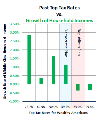
THIS POST IS MOSTLY about the correlation of corporate tax rates with growth in household incomes, but I'll begin with a revision of the chart on top income tax rates.
This is meant to address all the constructive criticism which has come my way in the last two days—as some people found the previous chart confusing.
So here's a new version, with less information on the whole, and one minor edit:

The data is the same as the previous chart, except that I removed a single bar which showed income growth with taxes at 38.5%, because that rate only existed for a single year, and I thought it was misleading to include it, as the effect of a tax rate probably takes time to kick in. (The previous years had been at 50%.)
Fair disclosure: I did not remove the 74.7% data, even though that is an average of only two years, because rates had been similar for the previous decade even though I only had the household income figures for 1968-1970.
I think it's easier to notice, on the new chart, that the difference in tax rate between the two proposals on the table is relatively small, while the difference for the middle class may be between gaining or losing ground.
But on to corporate tax rates:


